


Introducing Tile Layers
A good executive dashboard tells a story at a glance: how the business is doing, where to look closer, and how fresh the numbers are. Navicat 18's Business Intelligence (BI) tool adds a few features that make that story easier to build and keep current. Today we'll be putting together a simple sales overview dashboard and using a Tile Layer. The next several articles will cover the new Parameters, Page Navigation, and Auto Refresh features.
This tutorial assumes you've already created a data source connected to the MySQL's sample classicmodels database, built three charts similar to those referenced below, and created the dashboard itself. The steps below start from that point.
Laying Out the Dashboard with Tile Layers
Suppose that you have the following three charts: total revenue by product line, a monthly sales trend, and a table of top customers by order value - all pulled from the orders, orderdetails, and customers tables. Rather than positioning and resizing each one by hand, let's use a Tile Layer:
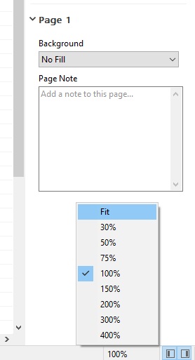
- First, let's zoom out to show the entire page. To do that, click on the zoom control in the bottom right corner of the BI Workspace window (where it says 100%). That will open the context menu, which offers a variety of zoom presets. Select Fit so that we can see the entire dashboard:
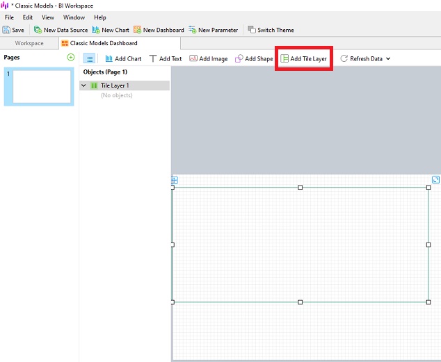
- On the Dashboard tab, click Add Tile Layer and drop it onto the page by selecting the desired area with the mouse pointer.
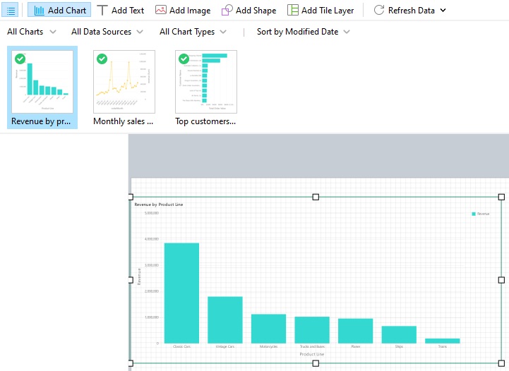
- Now we're ready to add the three charts to the Layer. Click the Add Chart button and drop the first chart directly within the boundaries of the tile layer container. You'll see it change color when it's time to let go the mouse button and drop the chart onto the layer. It will expand to take up all of the space in the layer:
- If we drag the second chart over the layer, we can see a colored square showing where the chart will be placed:
Let's put it to the right of the first chart.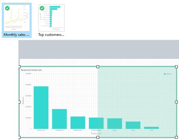
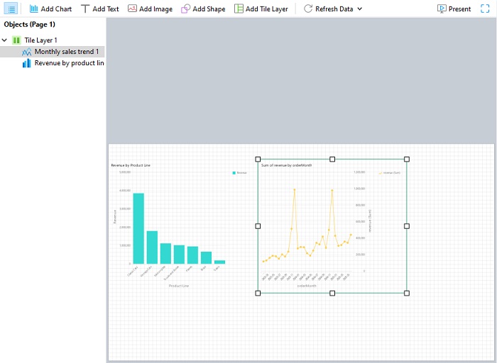
- Follow the same process for the third chart.
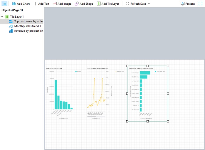
Fine Tuning the Layout
With all three charts in place we're ready to arrange our dashboard.
- We'll begin by expanding the layer to fit the entire width of the dashboard. To do that, grab the square handle on the right layer boundary and drag it to the far right side of the dashboard.
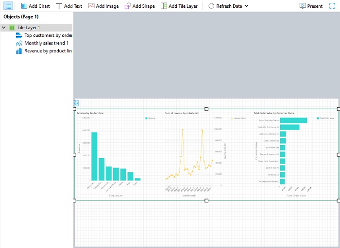
- The layer's properties pane contains a couple of drop-down menus that can help quickly arrange the charts: Layout and Distribution.
- Layout is set to Horizontal by default, so the charts sit side-by-side.
- Distribution is set to Fill Equally, which causes the three charts to automatically resize to share the available space evenly.
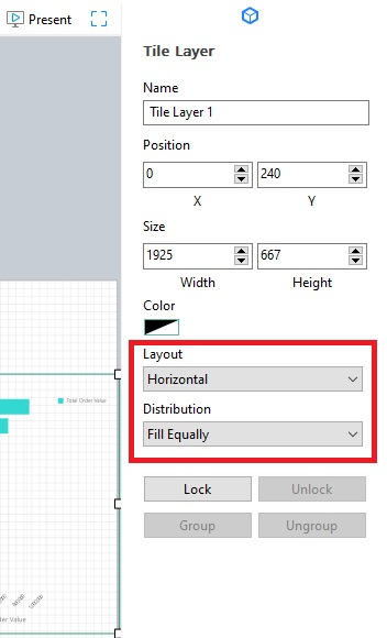
Both of these settings are fine as they are so we won't change them.
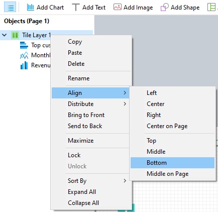
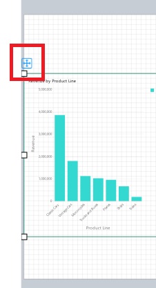
The final adjustment we'll make is to position the layer at the bottom of the page. There are a couple of ways to accomplish that:
- The first is to right-click (or Ctrl-click in macOS) the layer in the Objects pane and choose Align -> Bottom from the context menu:
- The other is to manually drag the layer via the position icon directly above the upper left corner:
- The first is to right-click (or Ctrl-click in macOS) the layer in the Objects pane and choose Align -> Bottom from the context menu:
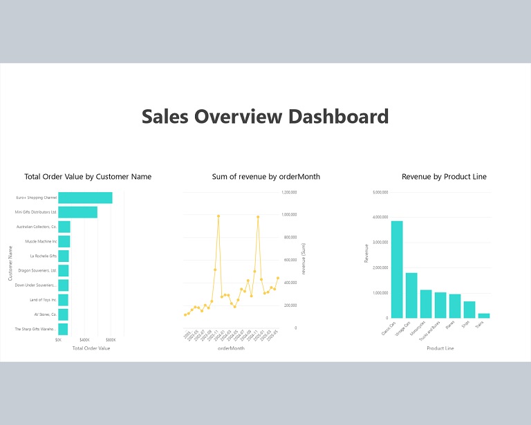
Here is the finished dashboard in Present mode - complete with a title!
Putting It Together
When combined, Navicat 18's new BI features turn a handful of charts into an impressive reporting tool: a layout that adapts as it grows, a filter that lets viewers explore without rebuilding anything, navigation between related views, and data that stays current on its own. In next week's article, we'll learn how to use Parameters, which are reusable variables you define once at the workspace level and then apply as a filter to multiple charts at once.